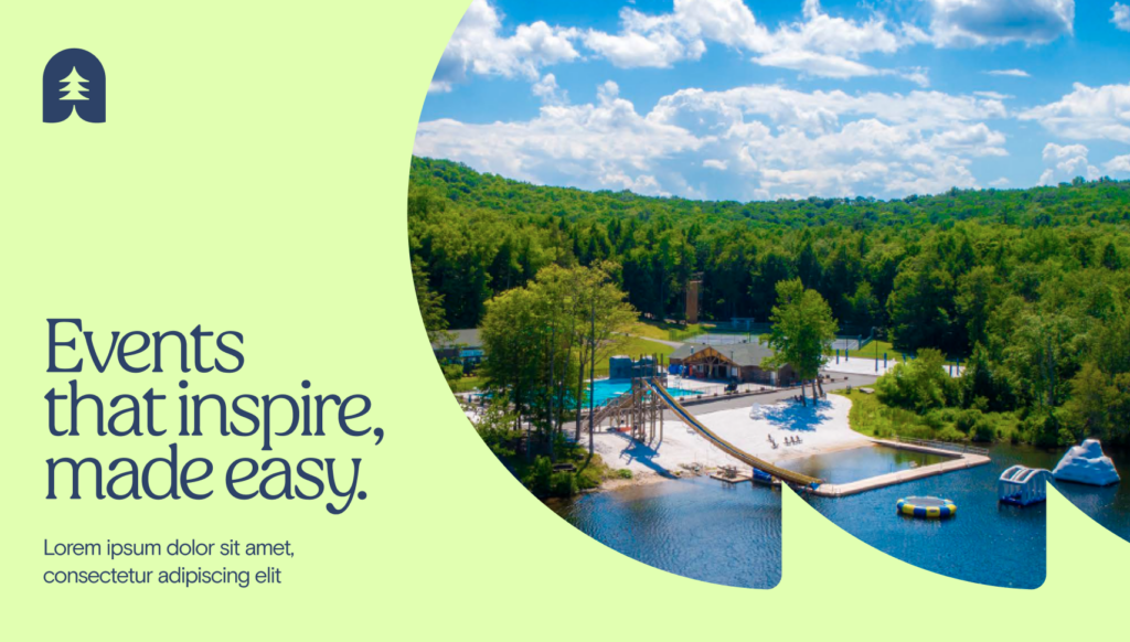
Brand elements
Logo
The following section provides detailed information on the correct size, color, clear space, and other visual aspects for our Allaway logo.
Primary logo
Vertical stacked logo
A symbol

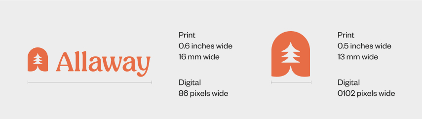
Logo clear space and minimum size
Clearance
Incorrect logo usage
To maintain the integrity of the brand, avoid manipulating or modifying the Allaway logo. These examples are select instances of incorrect usage of the logo.
Logo color usage
Full – color logo
Our logo should only be used with the pairings below; see guidance for color pairing examples.


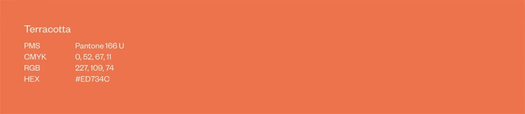
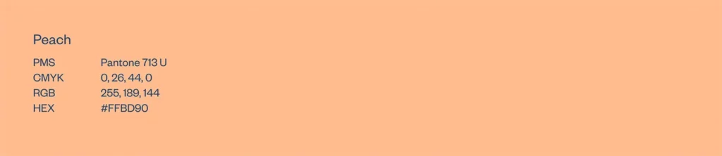
Color
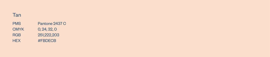
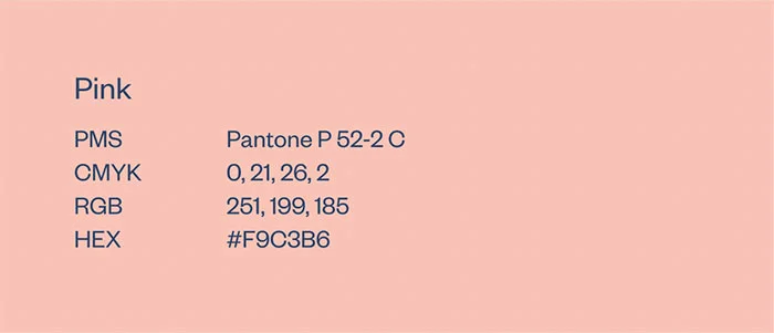
Consistent use of color will help unify all applications of the Allaway brand. Our color system is intended to provide a modern look, a sophisticated but approachable feel, and an overall presentation distinctive from others in our industry. Remember to use RGB or Hex values for digital tactics only, and CMYK or PMS values for all printed materials.
Primary

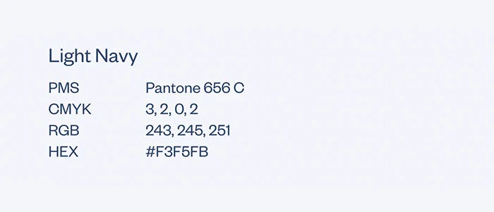
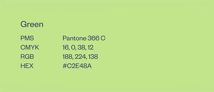
Secondary
Our secondary palette brings a mix of cool tones and an unexpected pop of energy to the visual identity system, and is reserved for copy, navigation, and icons.


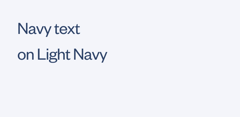
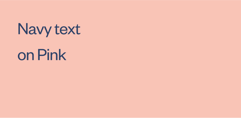
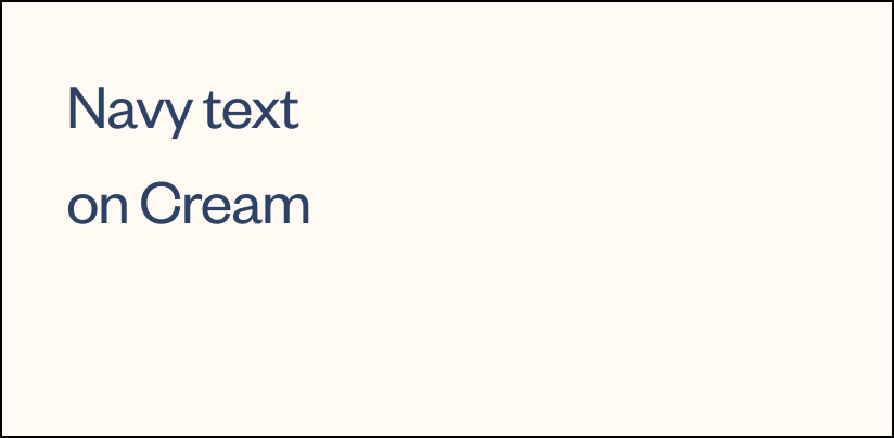
Text color pairings for print
Acceptable color/text pairings
To ensure our content is cohesive and accessible, these color pairings are the recommended options for pairing color and text.


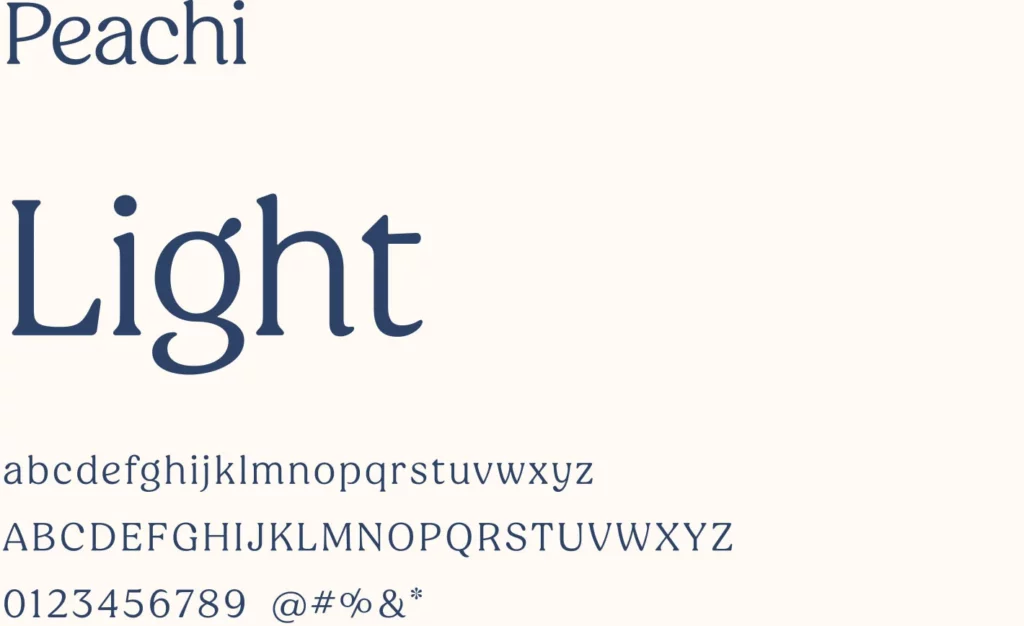
Typography
Typography is an important aspect of our brand identity. Our typographic style contributes to our overall aesthetic.
Peachi is our primary display typeface for large text. While composed of various styles, our brand works with one select weight: Light.
Basis Grotesk is our sans text weight typeface. It is ideal for subheads, body copy, and footers. Our brand works with these select weights: Light, Regular, and Medium.
Typographic hierarchy
It is important to establish a clear typographic hierarchy when typesetting copy to ensure we emphasize our key content in the intended sequential order.
Title Headline
Sub-headline

Lead
Paragraph

Link

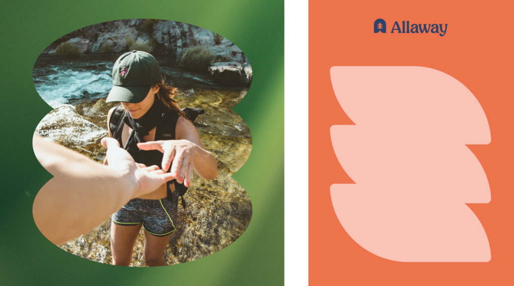
Icons
Our icons are created using a mix of solid fill shapes paired with nature photography for a pop of color. We use curved shapes and minimal detail. These add a level of sophistication and fun to simplify complex levels of communication.
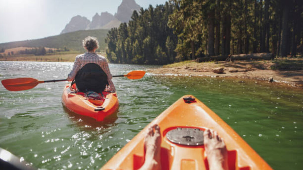
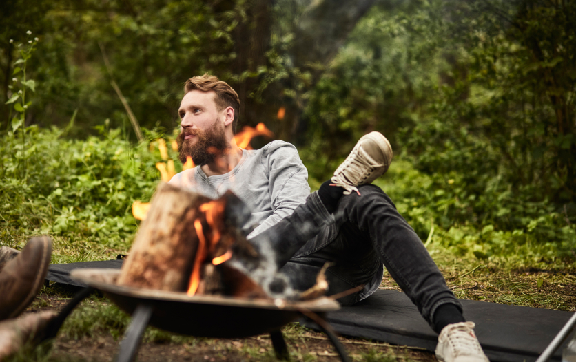
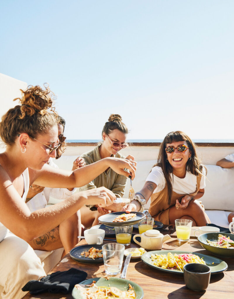
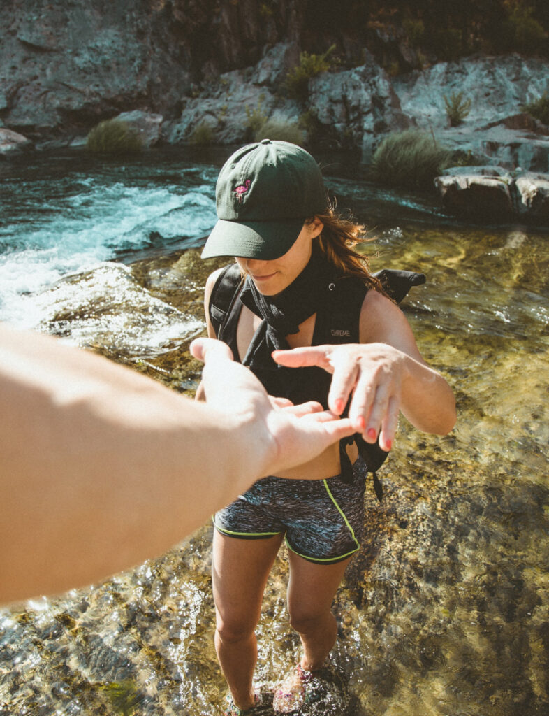
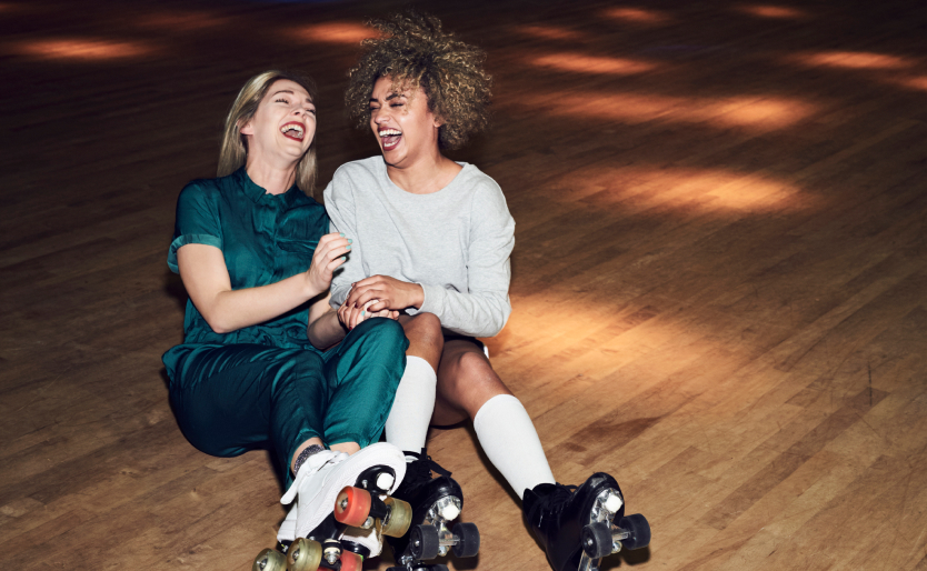
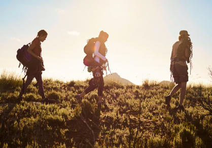
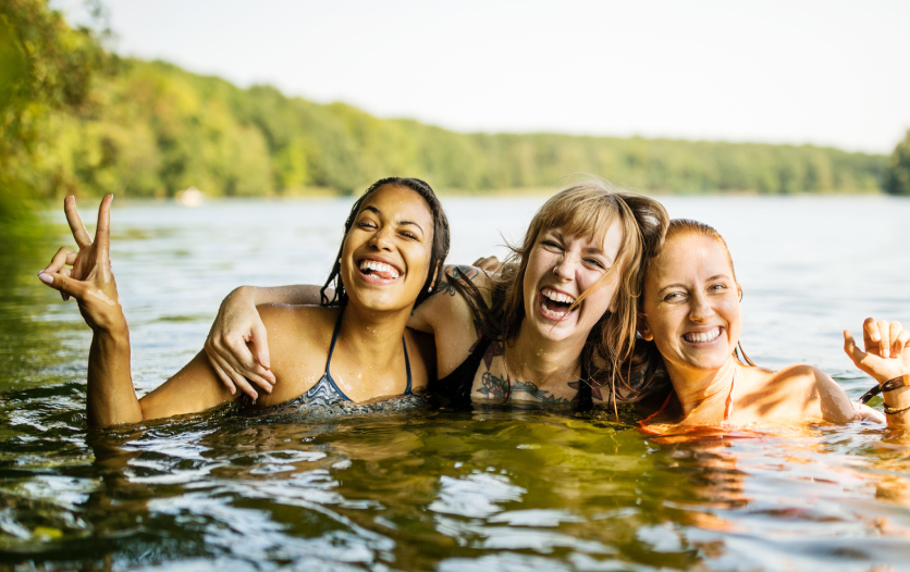
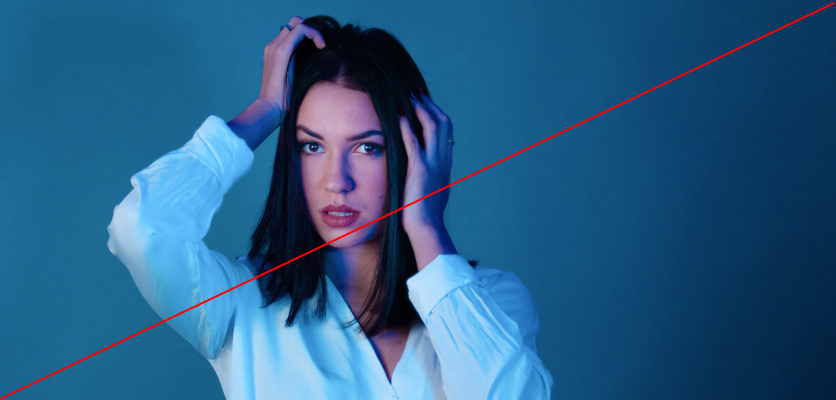
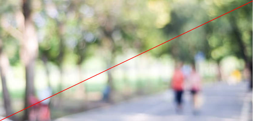
Everyday moment photography
We capture genuine moments of connection and peek into day-to-day lives to share the stories of those who make our community so special.
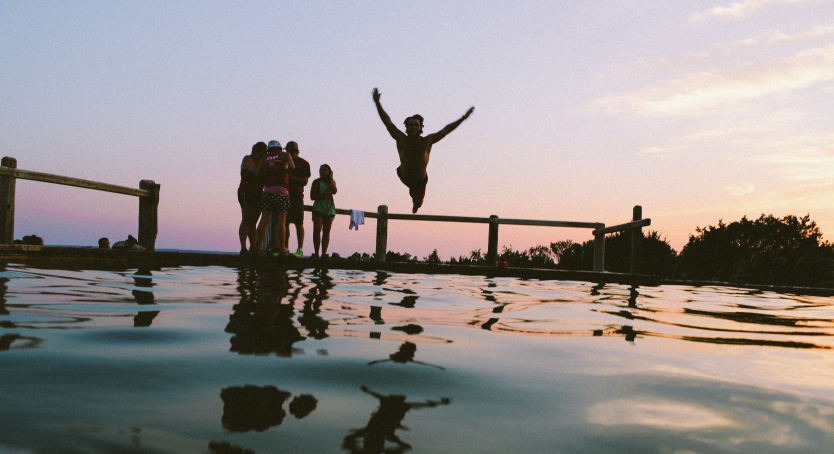
Sense of motion
Our imagery should always feel in motion, and have an inherit sense of action. We aim to feature multiple people interacting with each other as much as possible to help convey that nature of connection and energy through our images.
Light and color
Nothing is exaggerated—the lighting feels naturally vibrant, not forced, with a slight warmth in tonality and natural soft daylight. Look to inject colors from the brand palette (orange, blues, and warm midtones) through smart use of props, clothing, and background elements when possible.
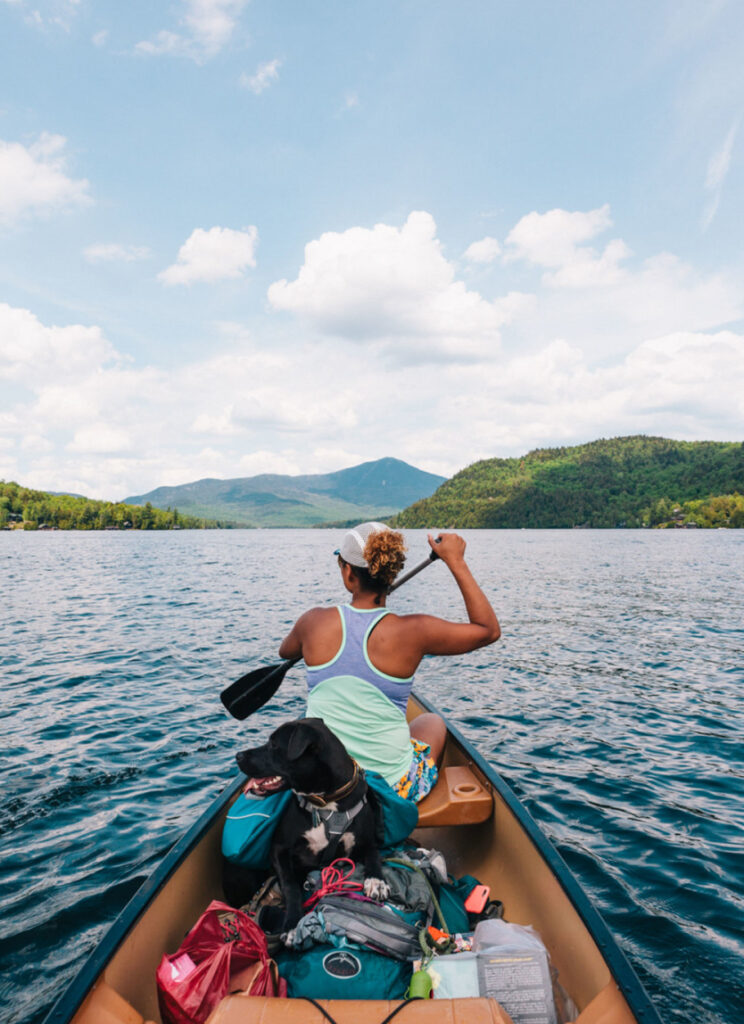
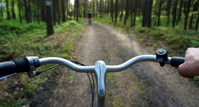
Composition
We use a mix of POV and eye-level imagery in our brand. Composition should feature a clear focal subject so you feel like we are in the room with you. The situation should feel composed but not posed. People can look into the camera or away from the camera—whichever is most genuine—but we should always see part of their face, so that we create an emotional connection.
Subject matter
We aim to capture a variety of settings and moments in time through our imagery. To do so, we show a mix of both active and passive moments to ensure we don’t skew overly active, making sure the quiet and intimate moments of connection are highlighted.
Incorrect usage
Below are some, but not all, instances of what to avoid for Allaway imagery.


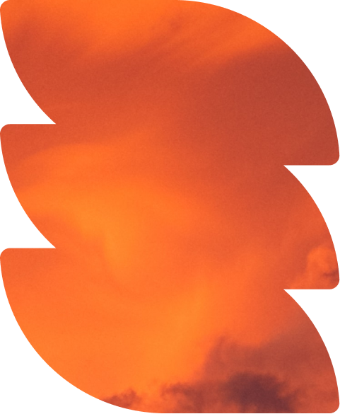
Nature photography and textures
We also use macro imagery of nature as a subtle way to highlight the great outdoors in layout. These textures can be paired with lifestyle images or icons, or used on their own to evoke nature throughout communications.


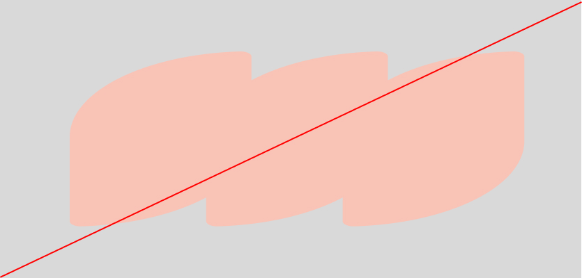
Shape language
Our shapes are inspired by the five elements found in nature, and may be used to hold imagery or as a solid flood of color. Maintaining a consistent style is key in order to achieve a cohesive brand appearance.
Rotation and orientation
Rotation and cropping are allowed depending on format and size of layout.
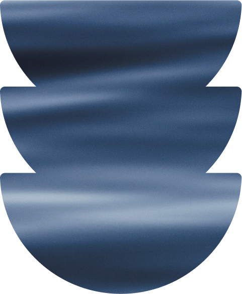

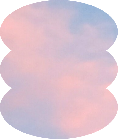

Shape proportions and cropping
We use our shapes with confidence, always starting with at least a 50/50 ratio for layouts and compositions
Extreme landscape
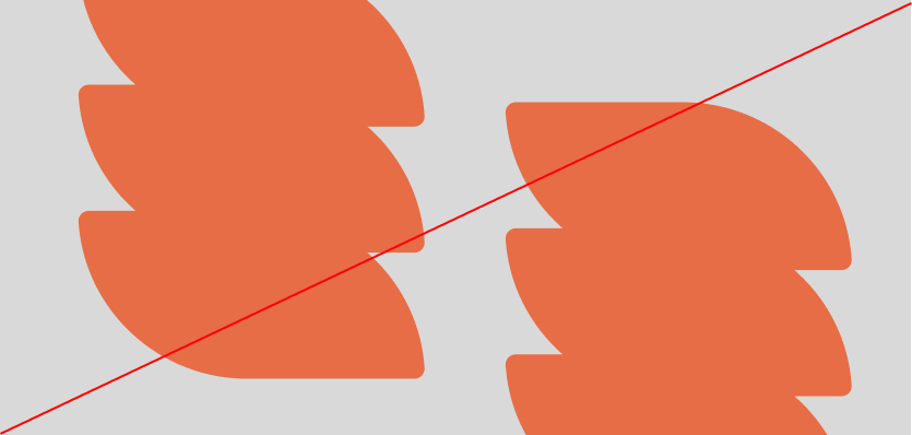
Incorrect usage
Below are some, but not all, instances of what to avoid for Allaway shapes.


Property indicators
Our property indicators provide additional opportunity to highlight the unique features of existing and future venues that Allaway offers.
Use them as a tool to highlight property attributes, the environment, and the unique setting of each venue.

MOUNTAINS

DESERT

FOREST

COASTAL

LAKESIDE